Brand standards
How to present PRLane: the logo and its files, exact colors, type, spacing, and the contrast rules that keep it readable.
Logo
PRLane has one mark and one horizontal lockup. Use the files below exactly as supplied: never redraw, re-space or recolor them.
- Mark
- Three curved lanes converge right into one forward path; use the original 96 × 88 master.
- Lockup
- The three lanes beside the outlined PRLane wordmark, 480 × 112. Use it at first contact, such as headers and footers.
- Minimum size
- Lockup at least 144px wide. Mark at least 24px high. At 16px, use the supplied favicon and check it in context.
- Clear space
- Leave at least one ribbon thickness around the symbol, preferably two around the full lockup. Never crop or stretch the artwork.
- Motion
- The five-second animation loops on Ink. Use the static master for reduced motion and provide a pause control.
Approved variants

Horizontal lockup, white
One-color reproduction on dark surfaces.
Download SVGDownload PNG
Three-lane mark, orange
Symbol on Ink surfaces.
Download SVGDownload PNG
Horizontal lockup, Ink
Default on light surfaces: Ink mark with an Ink wordmark.
Download SVGDownload PNG
Horizontal lockup, dark
Default on Ink and other dark surfaces: orange mark with a Paper wordmark.
Download SVGDownload PNG
Horizontal lockup, one-color Ink
Single-color reproduction on light surfaces, such as print or embossing.
Download SVGDownload PNG
Three-lane mark, Ink
App icons, favicons and compact headers once the name is established.
Download SVGDownload PNG
three-lane mark, Ink
Single-color mark on light surfaces.
Download SVGDownload PNG
three-lane mark, Paper
Single-color mark on Ink and other dark surfaces.
Download SVGDownload PNG











These are the same vector files prlane.com serves. Download them here rather than copying the logo from a screenshot.
Logo usage
Each example uses the real logo file. The don'ts are distorted with styling on this page only, to show what to avoid.
Do
Use the Signal lockup on Paper and other light surfaces.
Do
Use the dark lockup on Ink and other dark surfaces.
Do
Use the three-lane mark alone once the name is already on screen.
Don't
Don't stretch or squash the logo. Scale it proportionally.
Don't
Don't recolor the mark or wordmark outside the supplied files.
Don't
Don't place the logo on Signal Orange or busy backgrounds.
Don't
Don't put the light-surface lockup on a dark ground.
Don't
Don't rotate the logo or add shadows, outlines or effects.
Color
Six core colors, mapped to semantic roles for light and dark themes. Values are exact; copy them as written.
Ink
#181918rgb(24, 25, 24) · --tv-ink
Primary text, the wordmark on light surfaces, and dark surfaces.
Paper
#F5F3EErgb(245, 243, 238) · --tv-paper
Page background in light mode and text on Ink.
Signal Orange
#FF703Drgb(255, 112, 61) · --tv-orange
The T mark and the single main action of an area, always with Ink text.
Lavender
#BCA6FFrgb(188, 166, 255) · --tv-lavender
Focus rings and links on dark surfaces.
White
#FFFFFFrgb(255, 255, 255) · --tv-white
Raised surfaces such as cards in light mode.
Slate
#62645Ergb(98, 100, 94) · --tv-slate
Secondary and muted text on light surfaces.
How to use color
- Ink and Paper carry almost everything. Signal Orange is an accent, not a background for text-heavy areas.
- Use Signal Orange for the single main action of an area, with an Ink label. Its border is Ink in light mode and Signal Orange in dark mode (--tv-action-border).
- Never use Signal Orange or Lavender to mean a status. Status has its own tones, always with an icon and the literal state.
- A person's decision, such as a human approval, is solid Ink so it is never confused with a passed check.
Semantic roles
| Role | Token | Light | Dark |
|---|---|---|---|
| Background | --tv-bg | #F5F3EE | #181918 |
| Surface | --tv-surface | #FFFFFF | #222322 |
| Sunken surface | --tv-surface-sunken | #E9EAE5 | #2C2D2A |
| Text | --tv-fg | #181918 | #F5F3EE |
| Muted text | --tv-fg-muted | #62645E | #ABADA5 |
| Control border | --tv-border-control | #85877F | #80827A |
| Decorative border | --tv-border-decor | #DCDCD4 | #363733 |
| Action | --tv-action-bg | #FF703D | #FF703D |
| Action hover | --tv-action-bg-hover | #FF8659 | #FF8659 |
| Action pressed | --tv-action-bg-pressed | #E85F2F | #E85F2F |
| Action border | --tv-action-border | #181918 | #FF703D |
| Accent text | --tv-accent-text | #AE3A12 | #FF703D |
| Link | --tv-link | #6140AA | #BCA6FF |
| Focus ring | --tv-focus | #6140AA | #BCA6FF |
| Success status | --tv-status-success-fg / -bg | #296449#E0EFE6 | #7CCB9F#1C3327 |
| Warning status | --tv-status-warning-fg / -bg | #9A5700#FFF0CF | #E8B04E#3A2D12 |
| Danger status | --tv-status-danger-fg / -bg | #AC302B#FBE0DC | #FF9D94#3F201D |
| Review status | --tv-status-review-fg / -bg | #6140AA#E9E1FF | #BCA6FF#2C2545 |
| Neutral status | --tv-status-neutral-fg / -bg | #62645E#E9EAE5 | #ABADA5#2C2D2A |
Typography
Liberation Sans gives titles their character; Liberation Sans keeps everything else calm and readable. Use Arial and generic sans-serif fallbacks when the brand fonts are unavailable.
Liberation Sans
Ship the whole fleetDisplay and headings, h1 to h6. Weight 700.
Liberation Sans
See checks, reviews and conflicts together.Body copy, interface labels and controls. Weights 400 and 700.
DejaVu Sans Mono
PR #128 · 2a9f3c1Code, commit SHAs, IDs and exact values only.
Type scale
- Page title
Liberation Sans 700 · 56/60px desktop, 36/40px mobile · −0.025em
- Section title
Liberation Sans 700 · 28/34px desktop, 24/32px mobile
- Lead
Liberation Sans 400 · 18/28px · muted
- Body
Liberation Sans 400 · 16/28px
- Label
Liberation Sans 400 · 14/20px
- Caption
Liberation Sans 400 · 12/16px · muted
Spacing and shape
Spacing follows a 4px scale. Corners stay small and consistent so content, not chrome, stands out.
4px
8px
12px
16px
24px
32px
48px
64px
Controls4px radius
Panels8px radius
Marketing panels12px radius
- Control radius
- 4px--tv-radius-control
- Panel radius
- 8px--tv-radius-panel
- Marketing panel radius
- 12px--tv-radius-marketing-panel
- Control heights
- 32 / 40 / 48px--tv-control-height-sm / md / lg
- Table row height
- 48px--tv-row-height
- Focus ring
- 2px, 3px offset--tv-focus-width / --tv-focus-offset
- Motion durations
- 140 / 220 / 280 / 500mshover / panel / view / enter
- Easing
- cubic-bezier(0.2, 0.8, 0.2, 1)--tv-ease-standard
Voice and motion
Parallel work. One direction.
Keep your PR fleet moving.
Write PRLane with capital P, R, and L. Be calm, precise and useful: “2 PRs need review”, “Resolve conflict”, “Ready to merge”, “Waiting for CI”. Explain the next action. Avoid promises of guaranteed merges or capabilities that do not exist.
Three lanes arrive and converge, then the wordmark appears. The five-second sequence holds, fades and repeats on Ink. Provide a pause control. Show the supplied static master when reduced motion is requested; never delay content to play the logo.
Font files are not bundled. The definitive SVG wordmark is outlined. Liberation Sans uses the SIL Open Font License 1.1. DejaVu Sans Mono has its own DejaVu license terms. Follow the applicable license when obtaining or distributing fonts.
These are visual usage standards. The kit does not establish trademark clearance or exclusive rights to common geometric forms.

Loading and entrance motion
The Traffic loader for anything pending, the lane entrance the logo plays when the app opens, and pull to refresh on mobile.
Traffic loader


- The dimmed mark with one blip per lane, 0.23s apart, on a 1.4s loop.
- Show it only while something is actually pending. Never add a delay to show it.
- Always pair it with visible status text; the mark is decorative.
- Under reduced motion it becomes the still mark and the text carries the status.


Lane entrance




- Lanes wipe in left to right, top, bottom, then middle, with traffic running through. Then an orange cursor drives out of the exit lane and wipes the wordmark in.
- Plays once when the app opens in the header and sidebar, and again when the sidebar is toggled.
- Settles on the exact static logo and never delays the content around it.
- Under reduced motion the static logo shows immediately.


Pull to refresh (mobile)
On mobile, the Traffic loader is scrubbed by the pull itself, so the motion follows the finger instead of a clock.
- As the list is pulled, the mark scales in and the lanes wipe in top, bottom, then middle.
- Blips travel along their lanes exactly as far as the pull has gone.
- At the threshold the exit lane brightens once; release there to refresh.
- While refreshing, the regular Traffic loop runs; release early and the motion rewinds.
- Under reduced motion the mark appears whole on pull, with no scrubbed travel.
- #312Merge-queue pre-flight guardsReady
- #309Vercel preview links in the title cellWaiting review
- #88Move webhook retention to a cronConflicts
- #321Batch GitHub webhook upsertsCI failing
- #204Prorate seat changes mid-cycleReady
- #415Fix webhook signature checkWaiting review
- #22Pin Node 24 in CI imagesReady
Glyph field
The ambient background behind the PR Fleet Dashboard: a quiet field of drifting letters and numbers that answers the pointer. Move over the demo and click it.
Workspace color
- Idle, the field is dim texture only: muted glyphs in slow waves, never accent-bright and never a shape.
- Moving the pointer leaves a faint trail that lifts nearby glyphs and fades in under a second; it stays far quieter than a click.
- Each click sends out one slow ripple (200 px/s, about 5 s) in a random outline: circle, 3–8 sided polygon, flower or oval.
- Bright glyphs take the workspace's color in its themed text shade; the org-wide view uses blue.
- Use it only behind the PR Fleet Dashboard, under opaque cards. Never behind body text, forms or tables without a surface.
- Pause it in hidden tabs. Under reduced motion, show a single still frame with no pointer effects.
Launch film
A 48-second film for launches, the homepage, and social: coding agents open more PRs than a team can merge, and PRLane clears the bottleneck. It uses the lane entrance and the Traffic loader, Signal Orange on Ink or Paper, and the website's own headlines. It comes in dark and light, each landscape and vertical; the player picks the one for your theme and screen. Voiceover by Killian (ElevenLabs), timed line by line to the picture; captions follow the voice.
Social adverts
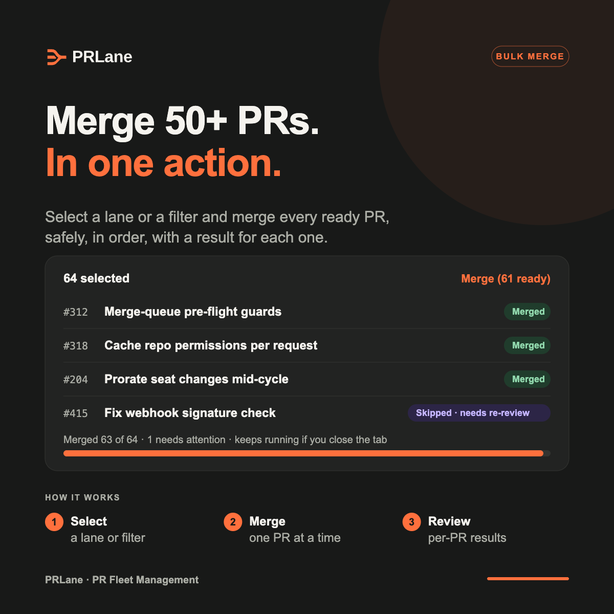
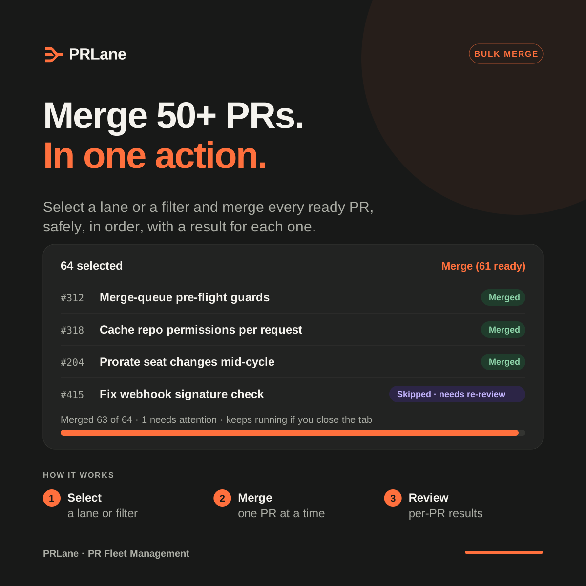
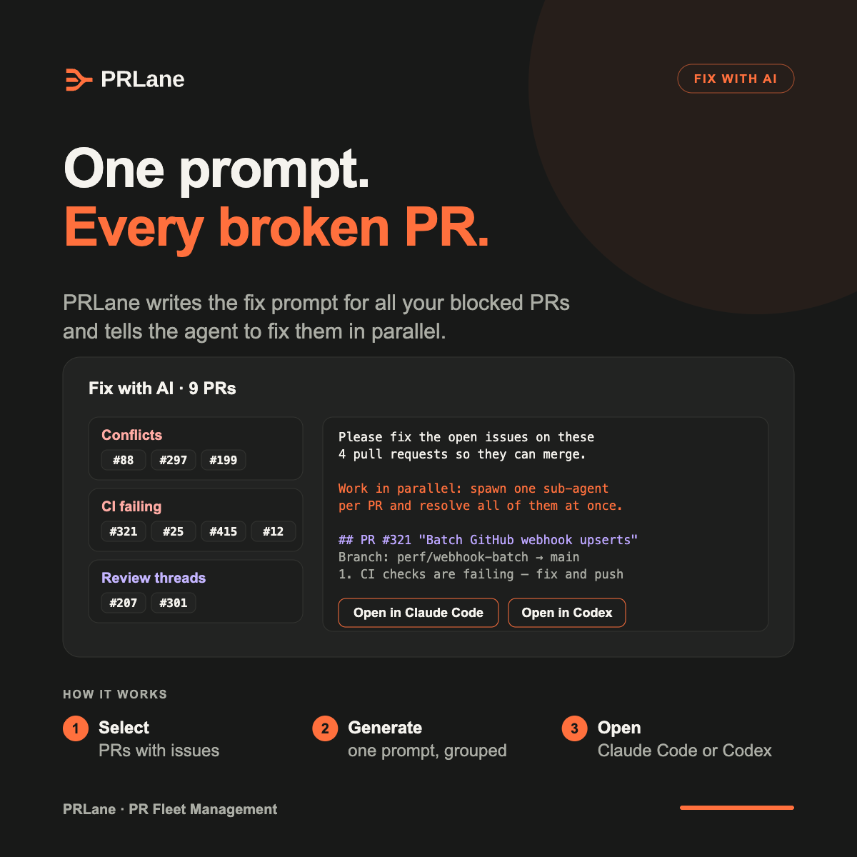
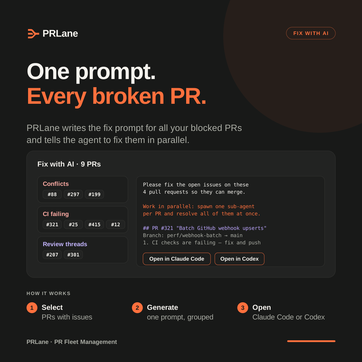
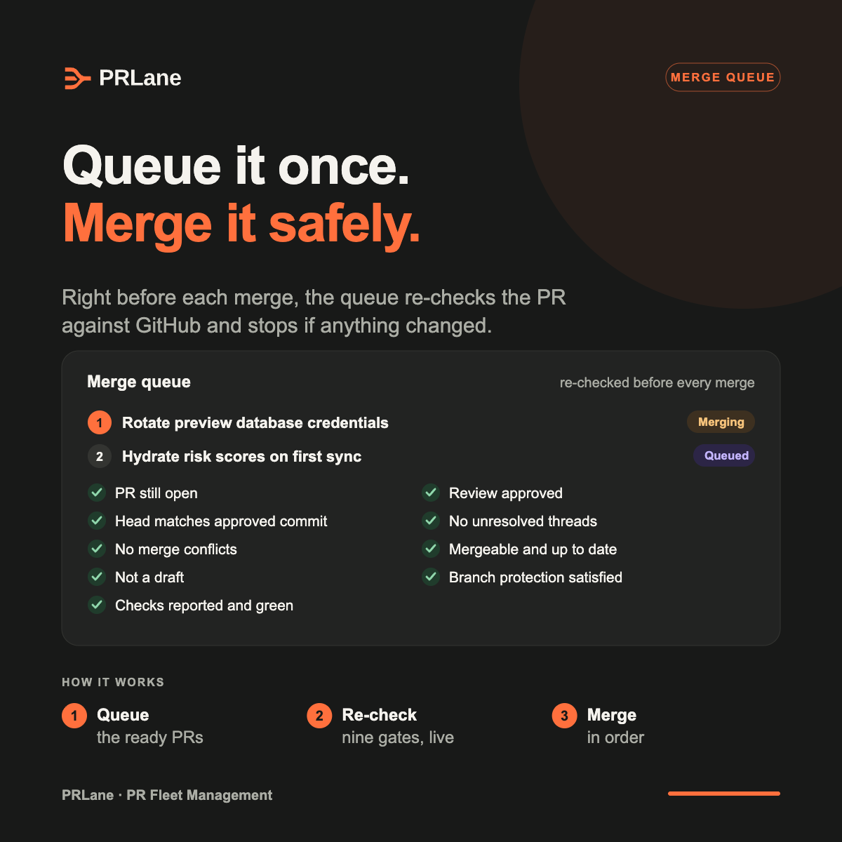
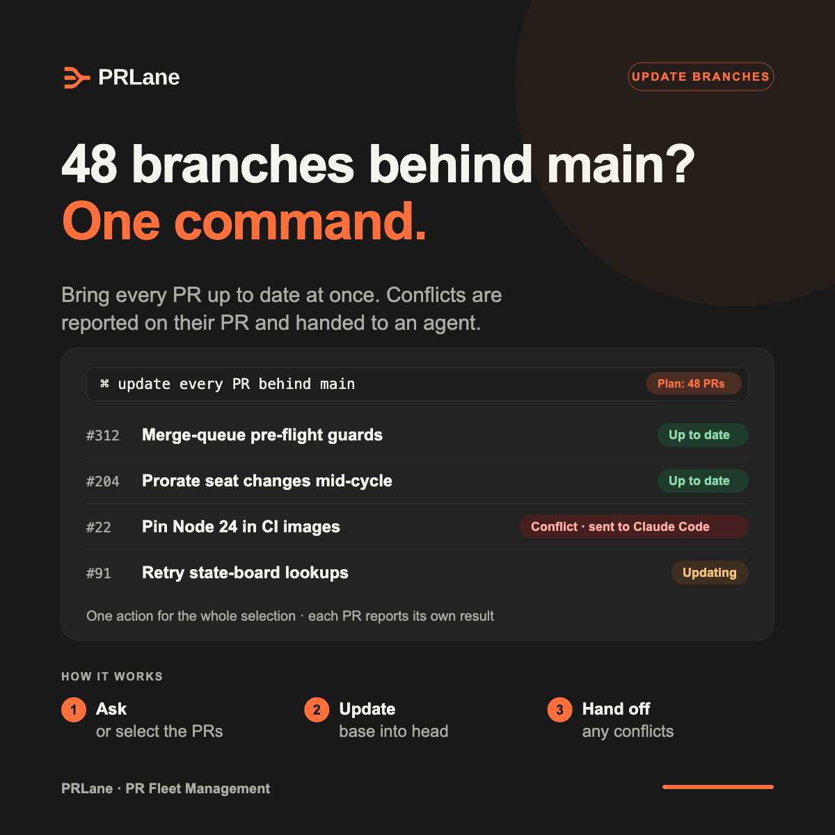
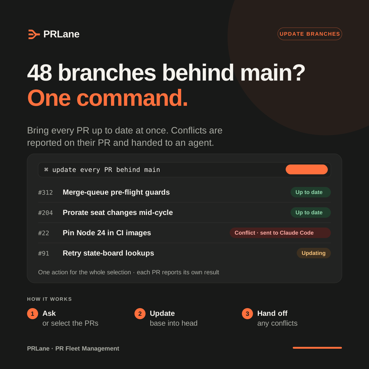
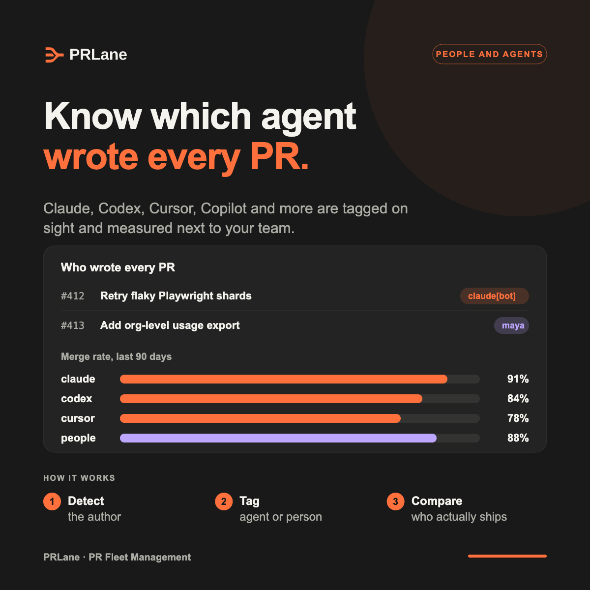
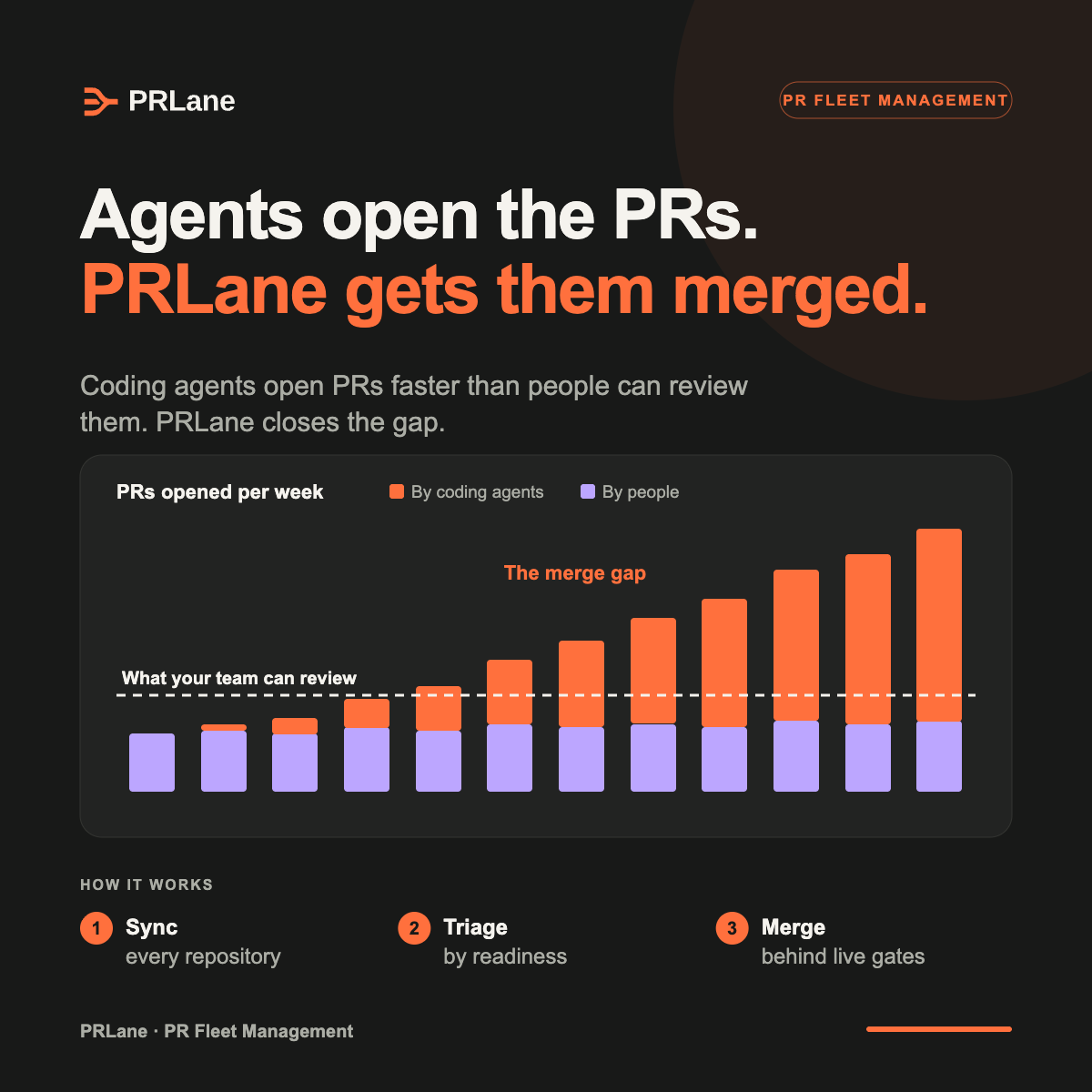
Ready-to-post 1200 × 1200 adverts for LinkedIn and other social channels. Each explains one thing that sets PRLane apart, with a three-step how it works. Open one to see it full size; post the PNG, edit the SVG.
- Merge 50+ PRs. In one action.
Bulk merge: select a lane or filter, merge in order with each PR re-checked, and get a result per PR.
- One prompt. Every broken PR.
Fix with AI: one prompt for every blocked PR, grouped by issue, with one sub-agent per PR in Claude Code or Codex.
- Queue it once. Merge it safely.
The merge queue's nine gates, re-checked against GitHub right before every merge.
- 48 branches behind main? One command.
Update branches: bring every PR up to date at once; conflicts are reported per PR and handed to an agent.
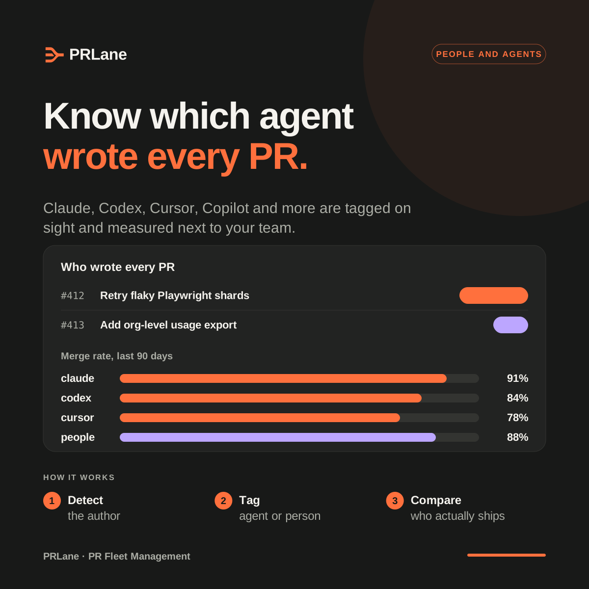
- Know which agent wrote every PR.
Agent attribution: PRs tagged by author and merge rates compared across agents and people.
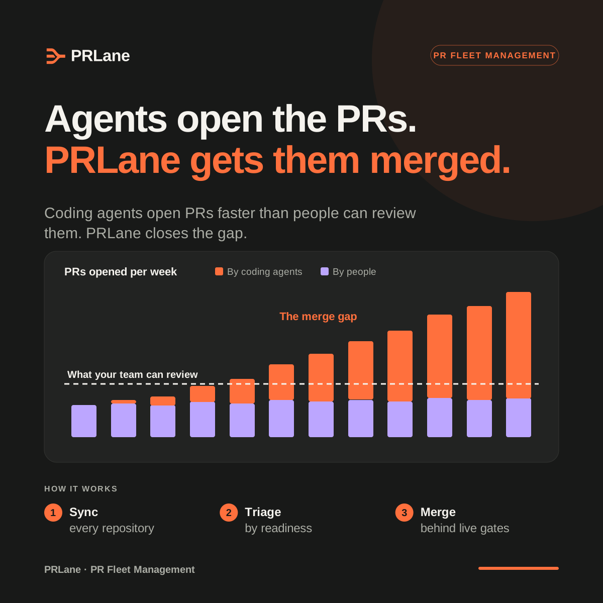
- Agents open the PRs. PRLane gets them merged.
The thesis: agent PR volume outgrows review capacity, and PRLane closes the merge gap.
Accessibility and contrast
Ratios below are calculated from the exact color values with the WCAG 2.1 formula, for both themes.
- Body text and labels reach at least 4.5:1 against their background; focus rings and control borders reach at least 3:1.
- Every interactive element keeps a visible focus ring: 2px, offset 3px, in the focus color.
- Status is never color alone. Pair the tone with an icon and the literal state, such as “Blocked”.
- Give logo images the accessible name “PRLane”, and name an icon-only home link “PRLane home”.
- Respect reduced motion: show the static logo instead of the entrance or loader animation.
| Pair | Minimum | Light | Dark |
|---|---|---|---|
| Text on background--tv-fg on --tv-bg | 4.5:1 | 15.90:1 | 15.90:1 |
| Muted text on surface--tv-fg-muted on --tv-surface | 4.5:1 | 5.99:1 | 6.95:1 |
| Muted text on sunken surface--tv-fg-muted on --tv-surface-sunken | 4.5:1 | 4.96:1 | 6.10:1 |
| Action label on Signal Orange--tv-action-fg on --tv-action-bg | 4.5:1 | 6.41:1 | 6.41:1 |
| Accent text on background--tv-accent-text on --tv-bg | 4.5:1 | 5.55:1 | 6.41:1 |
| Link on surface--tv-link on --tv-surface | 4.5:1 | 7.44:1 | 7.54:1 |
| Human approval label--tv-human-fg on --tv-human-bg | 4.5:1 | 15.90:1 | 15.90:1 |
| Focus ring on surface--tv-focus on --tv-surface | 3:1 | 7.44:1 | 7.54:1 |
| Control border on surface--tv-border-control on --tv-surface | 3:1 | 3.64:1 | 4.05:1 |
Pairs to avoid
- 2.48:1
Signal Orange text on Paper
Use Accent text (#AE3A12) for orange-toned text on light surfaces.
- 2.48:1
Paper text on Signal Orange
Action labels on Signal Orange are always Ink.